
CMGT WEbsite
A fast, clear accessible website design and development project that puts content to work
Strategy First Web Refresh
Process
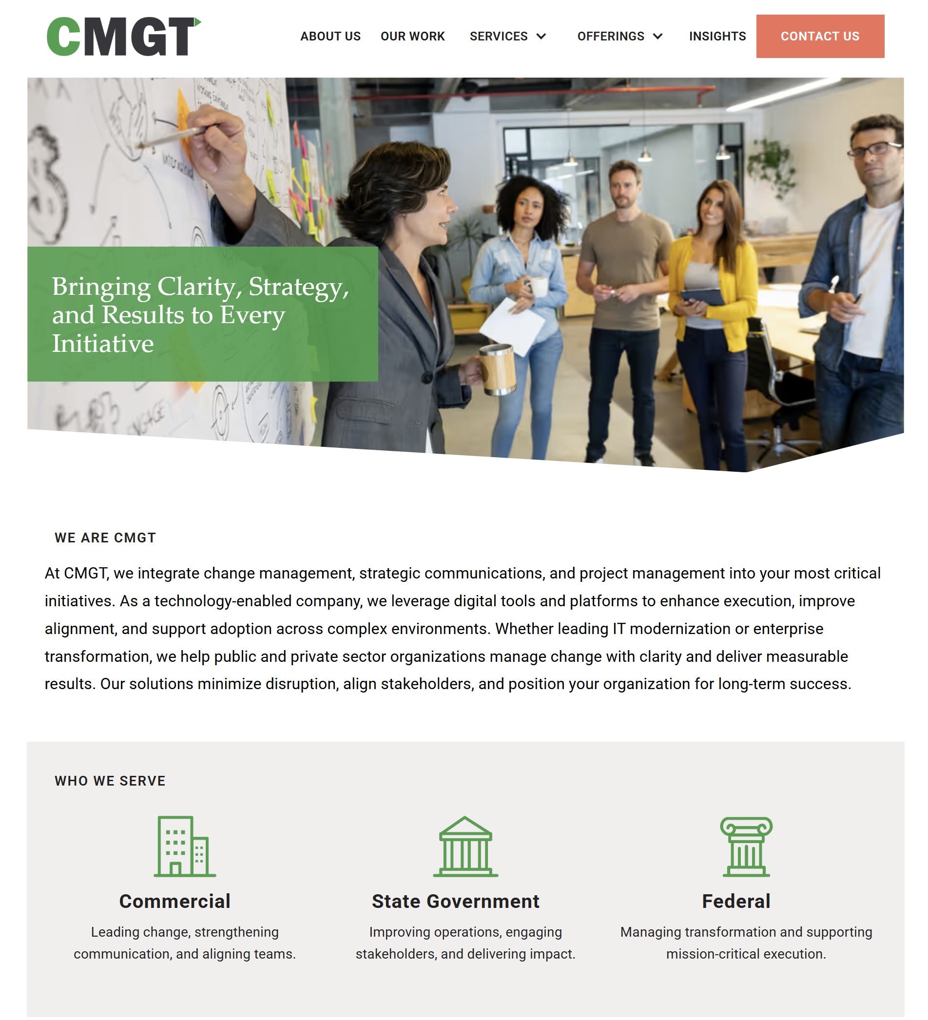
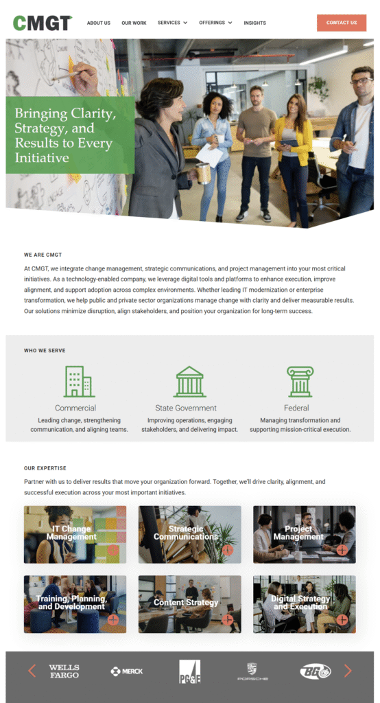
We started with goals, audiences, and the shortest path to answers. Then we simplified information flow and wrote tighter copy. The layout uses clear navigation, readable type, and consistent spacing. We followed our accessible website design and development checklist to improve structure, color contrast, link styles, and keyboard navigation. Page speed, alt text, and metadata were tuned to support ongoing SEO.
We also set content patterns for future pages. Each section leads with a strong headline, one idea per paragraph, and a plain language call to action. The aim is less searching and more doing.
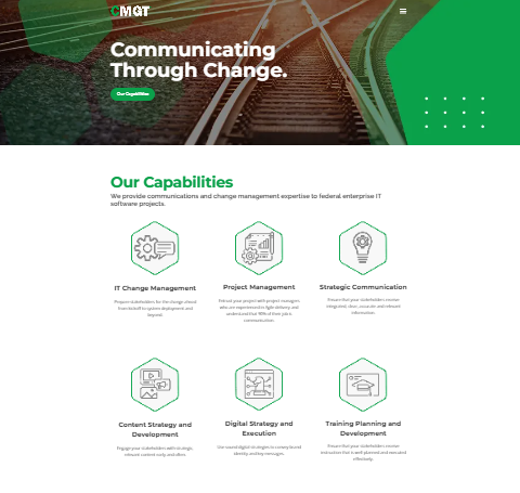
Before and After
Slide to compare
Results
Visitors land, understand, and act. Forms and calls to action are easy to find. Pages load quickly and are easier to maintain. This is the payoff of accessible website design and development that keeps people first.
Check it out for yourself here -> cmgtfederal.com

Lessons Learned
Speed and clarity convert. When the message is simple and the layout is clean, the site does the heavy lifting.
Internal links
- See Website Design + Development for our full process.
- Add strategic oversight with Creative Consulting + Brand Strategy.
- Related work: ProsimAcuitas.
External links
- We align with WCAG principles for accessible structure.