
CMGT WEbsite
Clear and accessible website design.
Strategy First Web Refresh
The Challenge
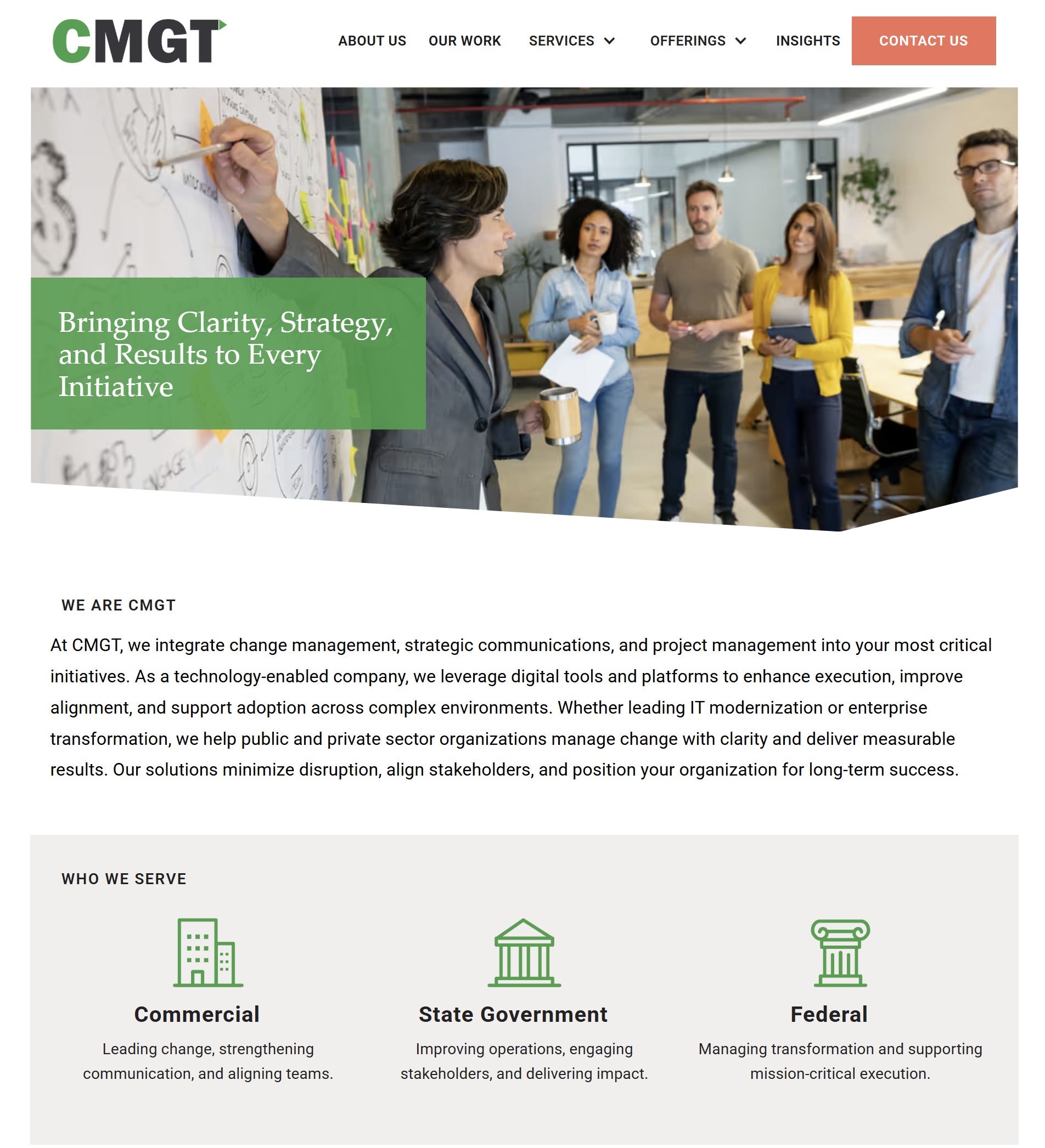
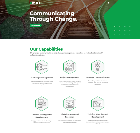
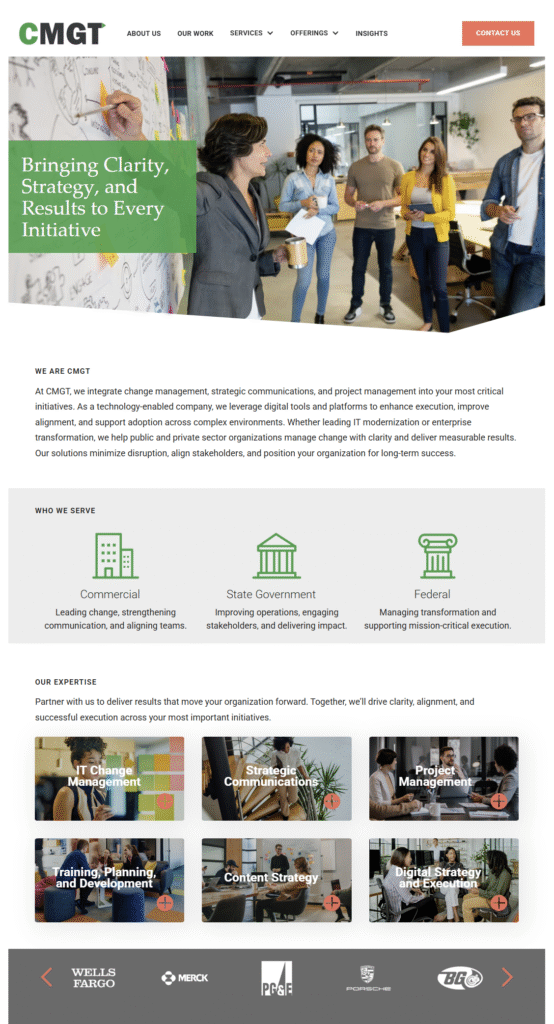
CMGT had grown into a mature, established GovCon firm — but their website didn’t show it. The old site was outdated, hard to navigate, and not built with accessibility in mind. In a market where federal clients size you up fast, a site that looks generic or behind the times isn’t just a cosmetic problem. It’s a credibility problem.
Process
We started by mapping goals and audiences, then focused on the shortest path from landing to understanding. Information architecture was simplified, copy was tightened, and the layout was rebuilt around clear navigation, readable type, and consistent spacing. Accessibility was built in throughout — color contrast, keyboard navigation, link styles, alt text, and page speed, not added as an afterthought. We also built content patterns for future pages so the team could maintain and expand the site without breaking the system. The build happened in Webflow, which gave CMGT a powerful, flexible platform they could manage themselves.
Before and After
Slide to compare
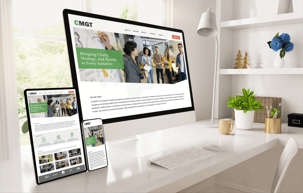
Results
The new site positions CMGT exactly as they are: a serious, capable firm ready for the work they’re pursuing. The before-and-after speaks for itself — but so does this:
“She delivered a site that makes CMGT look like the mature, established company we are. Even with AI design tools available, you still need someone with real design expertise to guide the direction. Otherwise, you’ll end up with something generic. Gloria brings that expertise.” — CMGT Client
Lessons Learned
A website refresh isn’t just a visual upgrade — it’s a credibility signal. For GovCon firms especially, looking the part is part of the pitch. And flexibility matters: timelines shift, platforms change, and the best creative partners move with you.
Check it out for yourself here -> cmgtfederal.com

Internal links
- See Website Design + Development for our full process.
- Add strategic oversight with Creative Consulting + Brand Strategy.
- Related work: ProsimAcuitas.
External links
- We align with WCAG principles for accessible structure.