westend bistro
An elegant refresh with hospitality branding and menu design
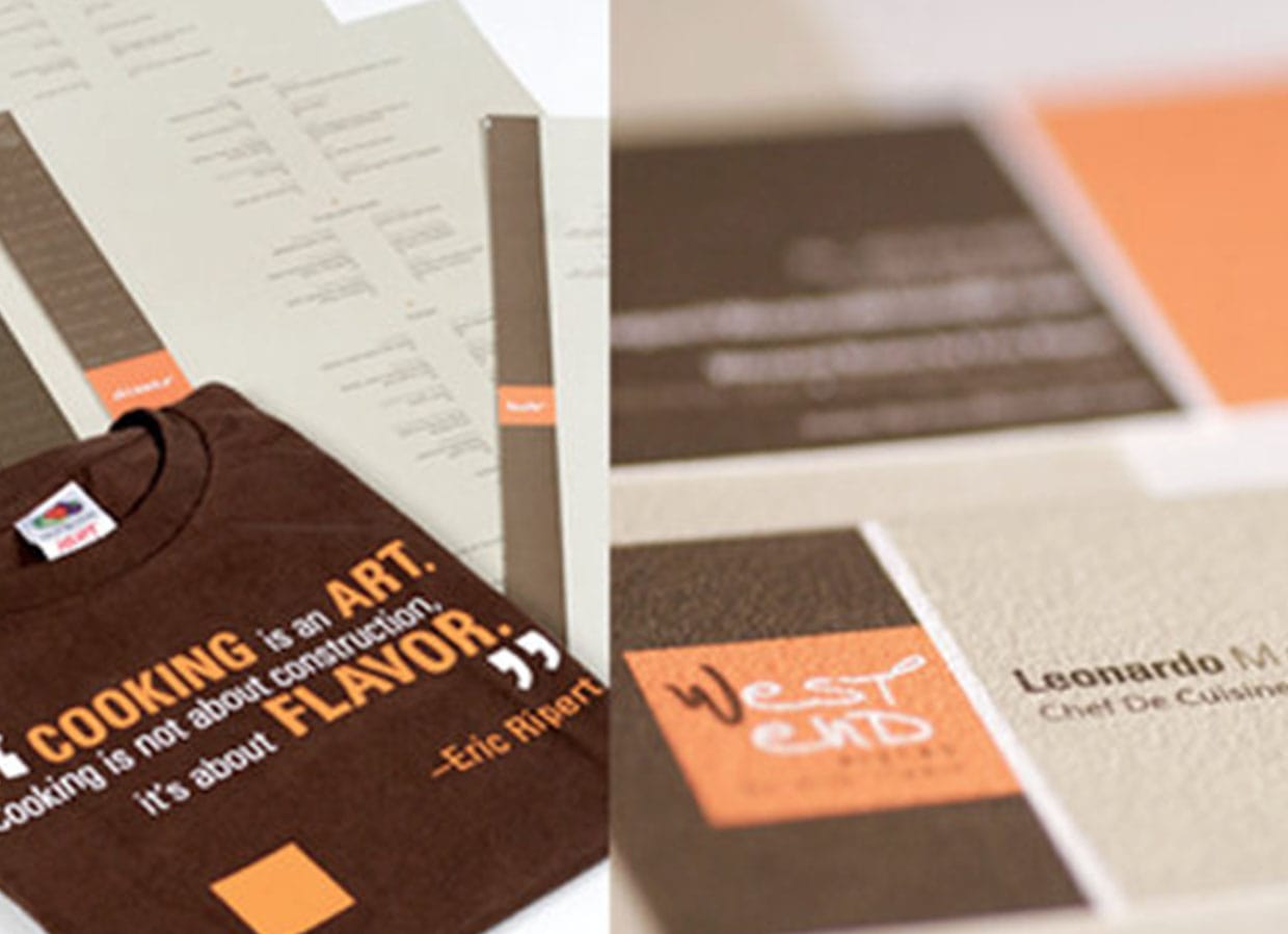
Visual Refresh + Collateral
Process
We began with a walk-through of the dining room during service to see how menus are used in the moment. Guests made choices fast when information was clear, so we focused on hierarchy, legibility, and a color system that guides the eye. The visual refresh included updated typography, spacing rules, and a simple icon set for specials and dietary notes.
From there, we mapped a toolkit for menus, table cards, check presenters, and social posts. Each file follows the same type scales and grid, which keeps updates simple for seasonal changes. The design allows the kitchen to highlight new dishes without reformatting the entire layout. We also documented print specs so reorders stay consistent from run to run.
Results
The refreshed look matches the experience on the plate. Guests find favorites faster, and servers move more easily through the menu when explaining specials. Social graphics feel aligned with the room, which builds recognition before guests arrive. The system is easy to maintain, so the team can swap items and prices without breaking the layout. In short, this is the everyday power of hospitality branding and menu design that puts the diner first.
Lessons Learned
Readable menus support better nights. When type, spacing, and color do their job, guests relax and enjoy the food.
Project Components
See more in
Internal links
- Explore Comprehensive Multimedia Design for menu systems and print production.
- Add a launch rhythm with Campaign + Event Creative.
- Related work: Cup o’ Joe.
External links
- Research on scannability and hierarchy from Nielsen Norman Group.