
Prosimacuitas
A crisp brand identity and landing page that builds trust for professional services.
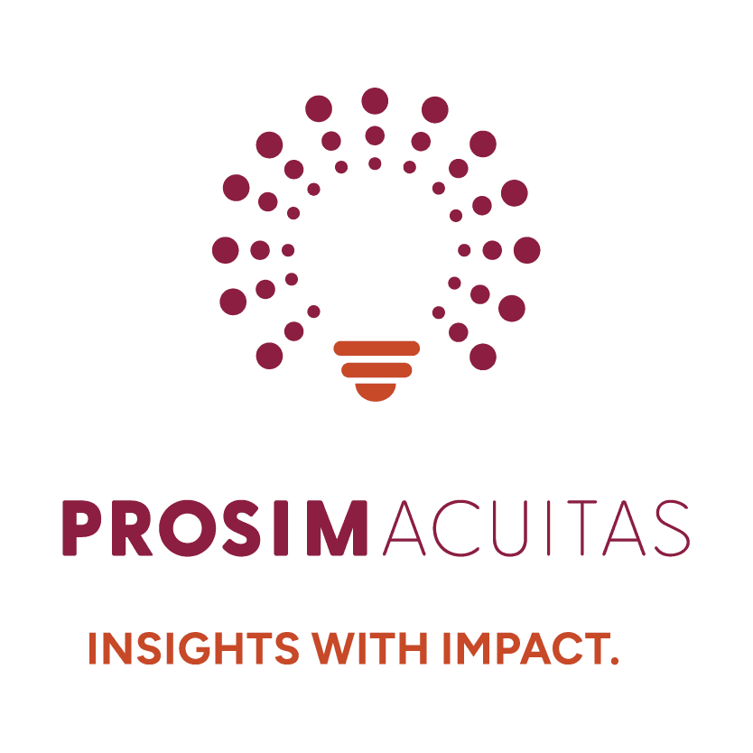
Visual Brand Identity + Website
Process
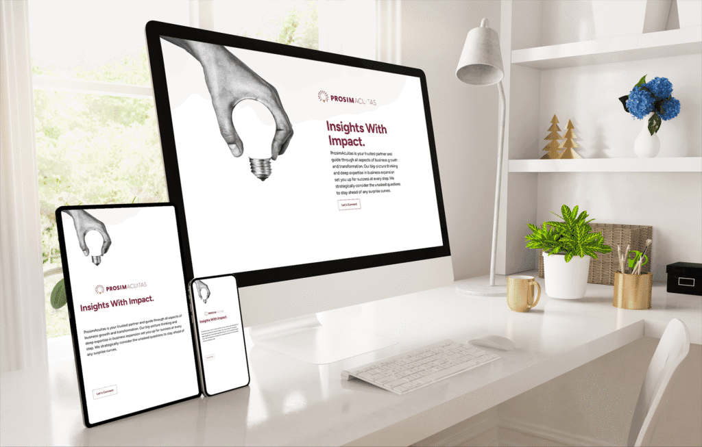
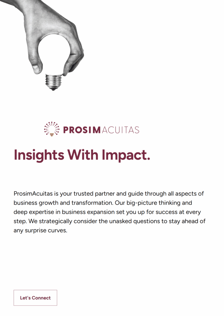
ProsimAcuitas needed a clean start that matched their smart, no noise voice. I led discovery to define message, tone, and must-haves. Then I created a simple logo system, typography rules, and a focused landing page with a clear hierarchy. We applied our brand identity design for professional services approach to keep every decision rooted in clarity, trust, and easy rollouts across web and print. The kit included logo lockups, color values, type styles, and usage notes so the team could extend assets without guesswork.
Because the site was a priority, we mapped a short layout that highlights value in the first screen. Strong headings, readable body copy, and clear call-to-action buttons keep attention. The lean build also sets the stage for later pages. For accessibility, we checked color contrast, link styles, and keyboard focus.
Results
The new identity feels sharp and confident. The landing page guides visitors to core value in seconds and reduces decision friction. The system is simple to maintain and supports future pages. This is how brand identity design for professional services turns clarity into action.
Check out the site here -> ProsimAcuitas.com
Lessons Learned
Less really is more when your audience wants clarity. A small, well-documented system beats a crowded toolkit and speeds future content.
Internal links
- See how we approach Creative Consulting + Brand Strategy.
- Explore Website Design + Development for fast, accessible builds.
- Related work: CMGT Website.
External links
- We follow WCAG color contrast guidance.