Cup o’ Joe
A playful restaurant and cafe brand identity with a clear, modern edge
Brand Concept + Launch Assets
Process
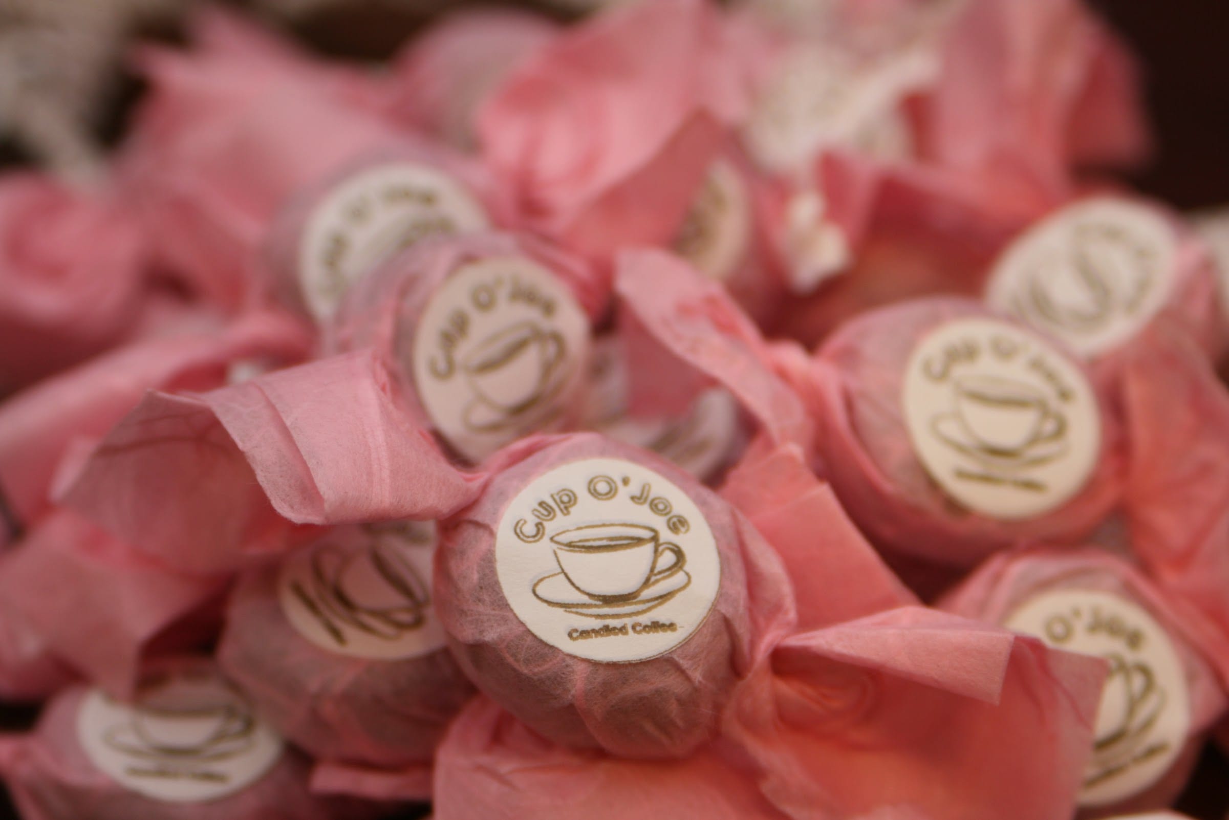
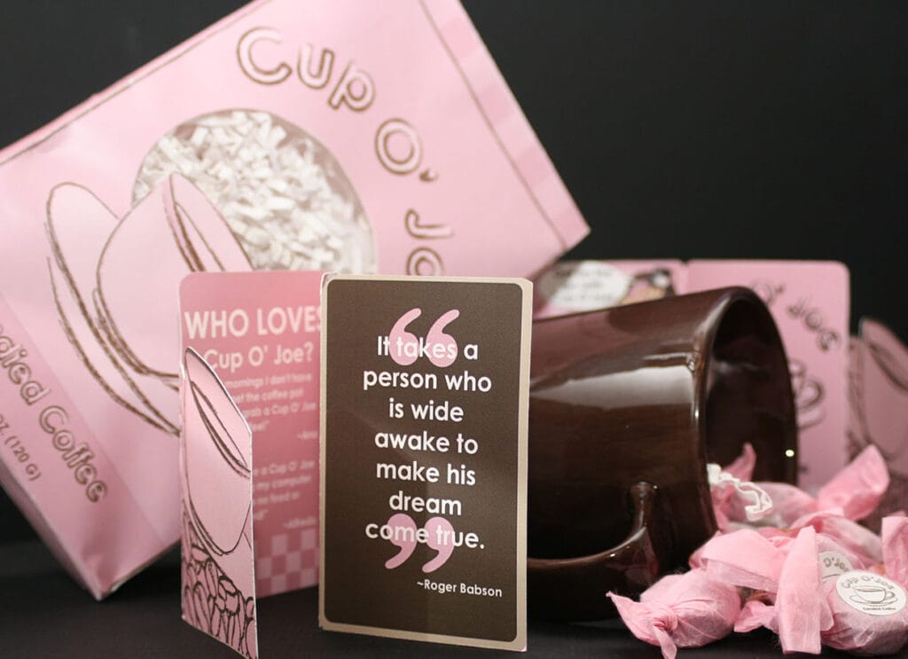
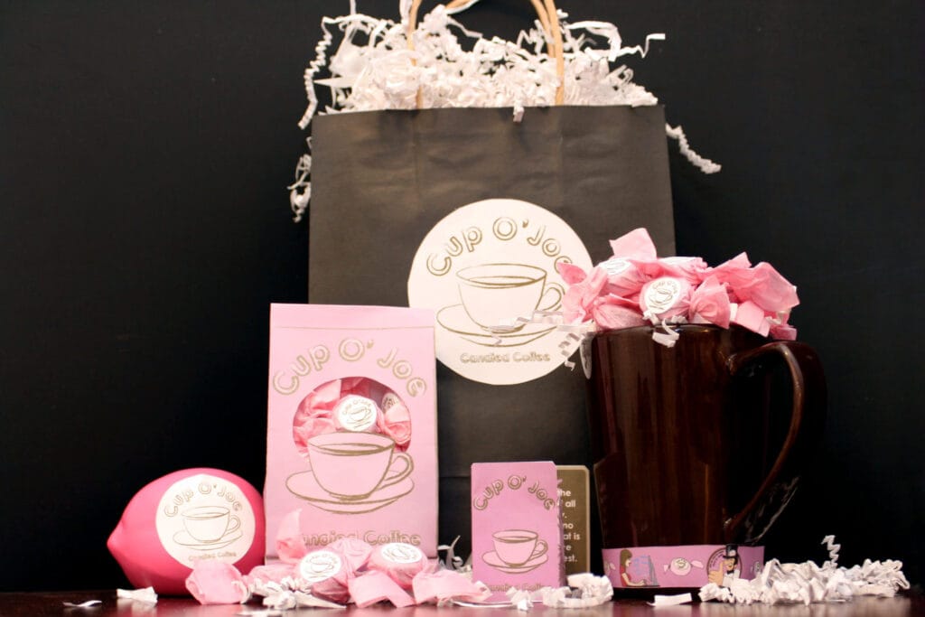
This concept began with three goals. Look friendly. Scale easily. Launch quickly. We explored naming cues, tone, and visual direction that fit a neighborhood cafe. The system uses bold type, simple shapes, and a warm palette that works small and large.
To keep things practical, we built a tight toolkit for menus, cups, signage, and social. The files include logo lockups, color values, type styles, and layout rules. Packaging mockups help preview shelf impact and test color under different lighting. Because the plan includes seasonal specials, the grid and spacing logic make updates fast. This is how a restaurant and cafe brand identity saves time without losing the vibe.
Results
The identity reads friendly and fresh. The same elements translate across print, packaging, and posts so the brand stays recognizable everywhere. Launch content lands faster because templates are simple to reuse. This is the strength of a clear brand identity.
Lessons Learned
A simple system scales best. Keep the brand kit lean, document it well, and every new asset looks like it belongs.

Project Components
See more in
Internal links
- See our brand process in Creative Consulting + Brand Strategy.
- Production ready assets in Comprehensive Multimedia Design.
- Related work: Westend Bistro.
External links
- We reference WCAG color contrast basics to keep menus readable.